- June 16, 2020
- Posted by: Nmcuong.91
- Categories: Data Analytics + Business Intelligence, Digital marketing

Heat maps are a great tool for visualizing complex statistical data.
Doctors, engineers, marketers, sociologists, and researchers of every kind use heat maps to make data sets comprehensible and actionable.
But what is a heat map? And how do you go about creating one?
Let’s dive into exactly how you can get started with heat maps today.
What is a Heat Map?
A heat map is data analysis software that uses color the way a bar graph uses height and width: as a data visualization tool.
If you’re looking at a web page and you want to know which areas get the most attention, a heat map shows you in a visual way that’s easy to assimilate and make decisions from.
What Does a Heat Map Show?
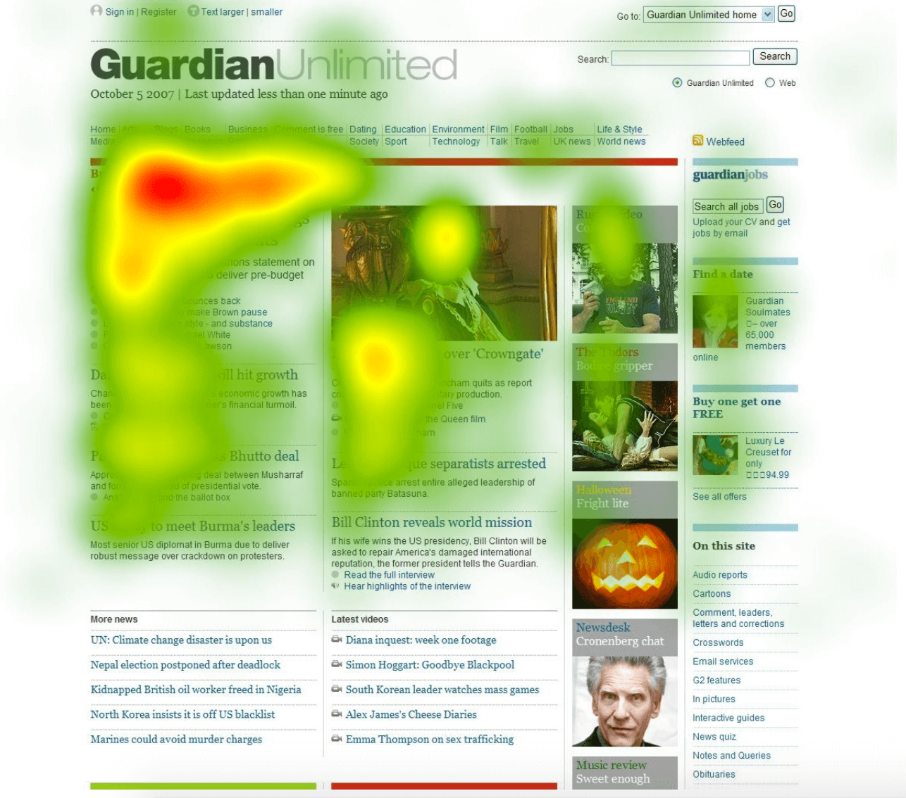
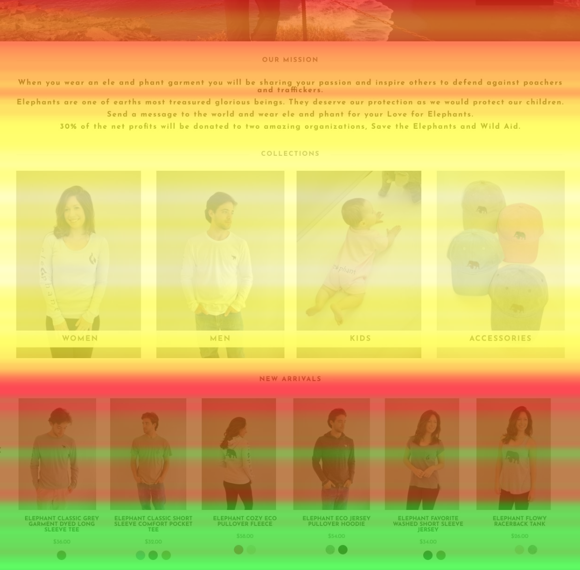
A heat map uses a warm-to-cool color spectrum to show you which parts of a page receive the most attention.
This heat map, for example, shows how far down the page visitors have scrolled:
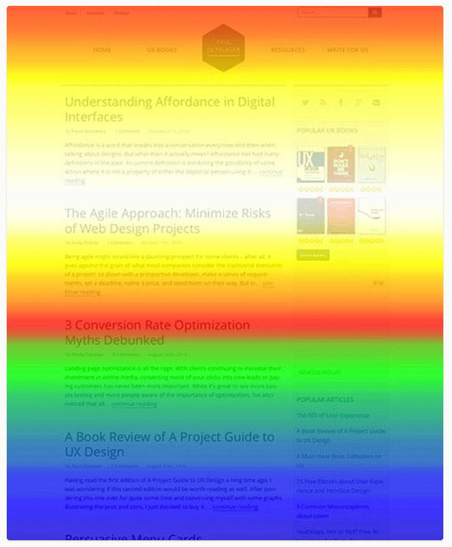
With a heat map, the data for your web page is right there: the CTA above the fold glows bright orange, or it doesn’t.
If it doesn’t, consider moving it higher up the page so it aligns with where visitors are paying the most attention.
For other easy ways to increase your conversion rates, check out this video from Crazy Egg:
You can think of heat maps as a form of visual storytelling. Creating a heat map helps you understand visitor behavior instantly.
They also help you answer a crucial question: “Where should the most important content be on this page?”
How does a heat map work?
Heat mapping software works by collecting data from a web page and displaying that data over the web page itself.
Here’s how Crazy Egg does it.
First, we take a snapshot of the web page at the URL you select. When the HTML of the page loads, versions of what’s loaded are sent to our servers too, thanks to a short section of JavaScript inserted into your site’s code.
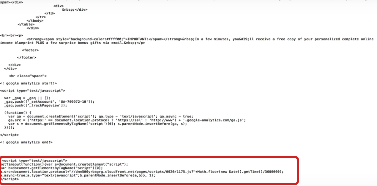
Then we create a map of all the elements on your page – everything that anybody might interact with. These and their tags and their parent elements are what we use to build a map of user activity on your page.
Next, we collect all the activity data. Every time a user does something on your web page, we flag it.
(We also use a piece of code to make sure we know it’s unique users, so you don’t get duplicate or multiple users messing with your figures.)
There’s a lot going on under the hood to make this happen, but the whole point of a heat map is that you don’t need to necessarily know about this to get value from it.
Suppose someone comes to your page and clicks on your CTA. We’ll record that click and add it to all the other information we have about that page.
Then when you view the page in the dashboard, you’ll see the aggregate of everything every unique user did on the page, which looks something like this:
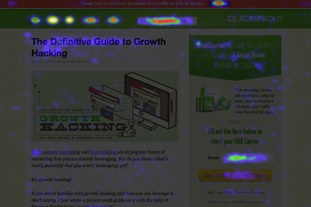
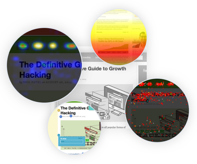
A heat map analysis gives you a visual overview of where your visitors click on your page — the more clicks, the brighter the area, creating what we call “hotspots.”
This means that when you look at your heat map, you can quickly see which areas of the page get a lot of action and which don’t.
Other Heat Map Types
In addition to heat maps, there are several reports that can show you where your clicks came from, how far visitors scrolled, and more.
Scroll map
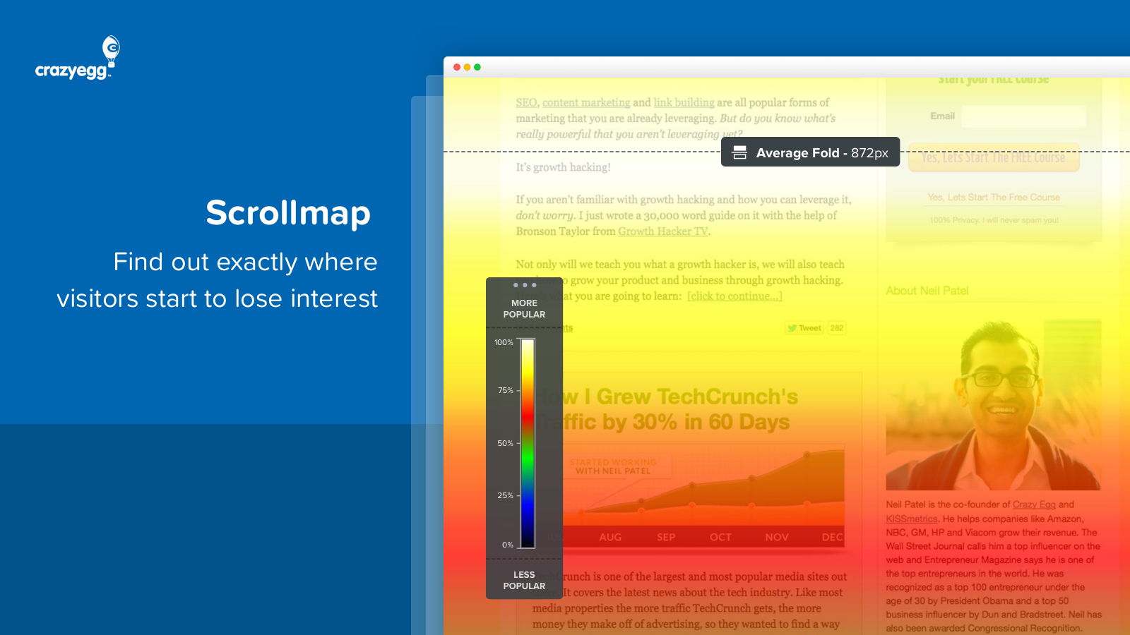
Should you have longer or shorter content on the page?
Where should that CTA be?
A scroll map lets you see what proportion of your visitors scrolled where before bouncing.
This matters because if most of your readers aren’t reading your long-form blog posts, you may be better off spending your time creating other types of content.
Scroll map tells you where the CTA sweet spot on your site is: the place most eyeballs see. It also tells you where your design isn’t quite on the nose.
Sudden, strong color changes can indicate that visitors “think whatever follows is no longer connected to what came before (called ‘logical ends’),” says Peep Laja, founder of Conversion XL. “These are sharp drop-off points that are hard to see with just Google Analytics.”
Confetti Report
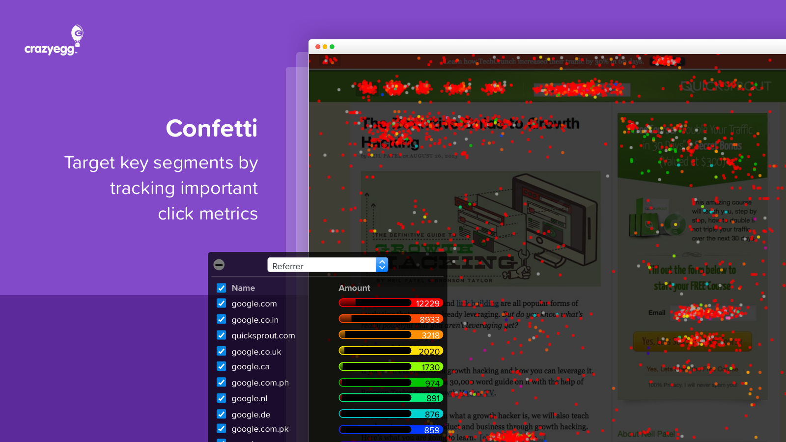
Confetti is like a highly specific version of a traditional heat map. It’s a high-resolution view that lets you see individual clicks, each represented by a colored dot on the report.
Why bother?
Partly because you’ll be surprised at the weird stuff people click on, including non-clickable elements. That can give you unique insights into how people navigate or fail to navigate your website.
For instance, let’s say a certain page has a high bounce rate. The confetti click track report reveals that people visit that page, try to click on a bunch of different items that aren’t clickable, and then get frustrated and leave.
They want to click through — they just can’t figure out how.
Now you know what to change to make the page convert.
Another really valuable application of the Confetti Report is its ability to track custom parameters – like whether someone visited your website from a paid advertising campaign, or a particular email blast.
We’ve written an entire article that explains more about how this tracking can help businesses — especially ecommerce brands — figure out what happens between a click and a purchase (or why many people leave a site without adding to cart).
Overlay and List Reports
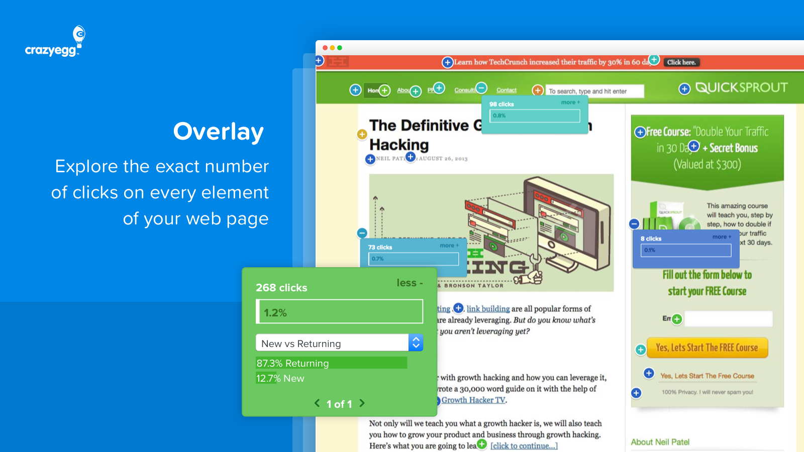
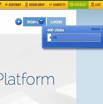
An Overlay report breaks down the clicks on your website into percentages per element. This lets you see exactly which individual elements generate clicks.
You can see in the thumbnail above that there are small plus signs on the page.
Each of these represents a page element, and their color represents how many clicks they get. Blue is fewest, while green, orange, and red represent progressively more clicks.
An Overlay report lets you see the breakdown of clicks on your page in a visual way.
It shows you what percentage of clicks each element has received (vs. the total amount of clicks on the page), and lets you drill down into demographics (like how many of those clicks came from a mobile device, or whether they came from a new or returning visitor).
It also lets you see which elements on the page were clicked on even though they weren’t actually linked to anything.
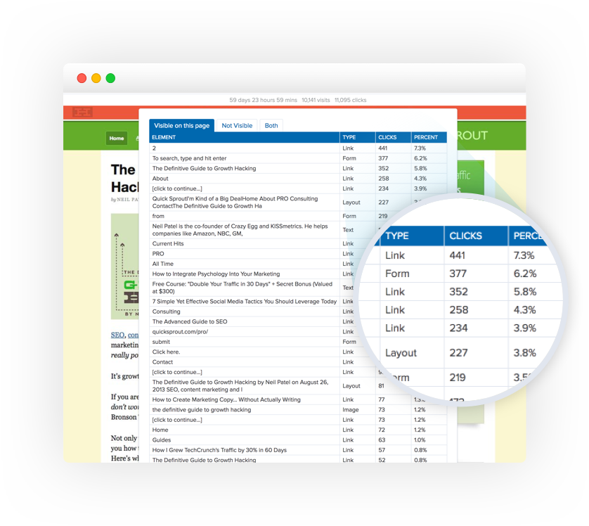
A List Report displays similar information, but in a graph format to make spotting trends (like whether your most-clicked elements actually aren’t links) easier on the eye.
When Should You Use a Heat Map?
All the time!
No, really. As flippant as it sounds, heat maps are so useful and so intuitive that you should pretty much have one on the go all the time and check it regularly.
Here are a few scenarios where having heat map data handy can help you quickly make better marketing decisions:
Website redesign
Redesigning a website can be an expensive, time-consuming undertaking. The last thing you want is a redesign that doesn’t work better than the original.
Graphic designers and UX professionals can use heat mapping tools to understand how user behavior is impacted by graphic elements like color, contrast, and placement, ultimately driving a website to convert more effectively.
Obviously, graphic designers already know all this stuff in principle. But different audiences behave differently on different websites.
Running heat maps before designing and launching a website redesign could save you from missing the mark and winding up with a site that doesn’t convert, or that your particular audience finds tough to navigate.
A/B testing
You’re doing this, right? A/B tests deliver crucial conversion bumps that can be the difference between a rapidly growing business and one that struggles to survive.
Heat maps can give you instant, usable insights into exactly what your visitors do differently on different versions of your landing page, blog posts, or even your home page.
When you’re testing moving the CTA button, changing the copy, or altering the images, you can see the page’s conversion rate and understand why one page converts better than another. (Hopefully, the test converts better!)
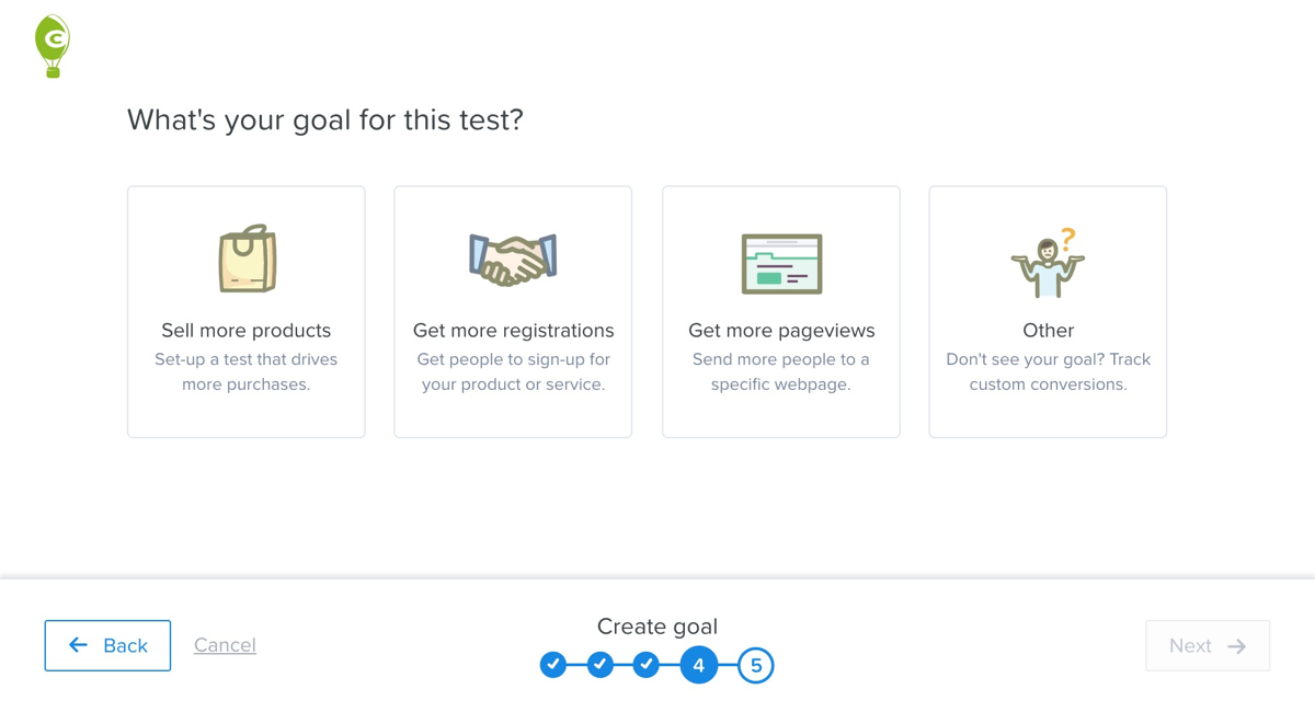
With a heat map, you can see exactly how conversion behaviors are different. Maybe a longer page converts better, so you think: let’s make all our pages long. Makes sense.
But what if the longer page has some other difference — more compelling copy above the fold, let’s say — and that’s what made the difference?
With a heat map, you can see immediately where people scroll and where they click, so you’re never in the dark.
Content marketing
Even now, most content is written. It’s words on a page.
Are your site visitors reading and engaging with your content?
Scroll maps can show you how far down the page your users scroll, so you know if they’re reading your content. Check out which CTAs get the most attention with a click map and you’ll know more.
For instance: let’s say Michael writes a fantastic, in-depth blog post on using his company’s product, DocuLoc, to keep documents secure.
He identifies use cases, documents what existing customers are doing, and goes into depth about why it’s important and why so many existing solutions don’t work.
If he’s super spammy and promotional about it, no one will read it; but he knows that, so the post is mostly about the challenges of the security landscape, not the product.
He posts the piece to his blog, tweets and shares it, and it gets decent traffic.
So far, so good.
The next week he checks out his visitor reports.
The scroll map shows that only about one in fifteen or twenty of his readers reach the end of the post. Hmm, thinks Michael. Maybe 7,000 words is a bit too long. Looks like no one really wants to read it.
But he’s an old hand so he checks the other reports too. The confetti report shows that, of the people who read to the end of the post, almost all are clicking on his CTA.
Michael doesn’t have an underperforming piece of content that people are bouncing away from; he has a lead gen machine that’s disqualifying unsuitable prospects before they even contact him!
He can learn all that from taking just a few minutes to consult the data, leaving him more time to write his next 7,000-word opus.
UX and Usability Testing
With all this opportunity to track where visitors are clicking and how far they’re scrolling, it just makes sense to test UX and usability.
Let’s say you’re an online retailer, and you’ve found that plenty of people are adding items to their shopping cart, but then they’re abandoning their cart at the last minute.
It’s time to do a little UX testing to see what’s going on.
Use heat maps and overlays to see where people are clicking — and where they’re getting stuck.
Is your checkout button looking blue? It could be that it’s not prominent enough. Try something more colorful or higher up on the page.
Are shoppers clicking on something that isn’t clickable? Or perhaps they’re getting distracted by the nav bar?
Remove those distractions from one variation of the page and then A/B test the two pages to see which one converts customers more.
Want to see website analysis in action? Check out this video where we analyze Crazy Egg customer Tommie Copper’s ecommerce homepage, using visitor reports and session recordings:
Conversion Funnel
Testing UX and usability, as well as the effectiveness of your content marketing efforts will also help you improve the way prospective customers move down the conversion funnel.
As we mentioned above, If a small number of people are reading all the way through a piece of content, but all of them are signing up for the email list, you’re improving the quality of leads for your sales team.
You can see all of this through scroll maps and confetti maps.
If, however, you see lots of visitors coming to your landing page, but almost no one is giving you their email or clicking on your coupon, look at your heat map to see where they’re clicking, if at all.
It may be time to A/B test a few different pages to improve usability and remove distractions that could be getting visitors stuck.
What You Can Learn from a Heat Map
Heat map data can help you to quickly see:
- Which headlines draw visitors in and make them click
- Which images attract attention and what people do about it — you’ll be surprised how many try to click an unlinked image
- What distracts visitors from your core content (Many first-time heat map users are shocked at how differently their users navigate the site compared with their expectations.)
- Whether visitors see your email opt-in box (Low opt-ins and click-throughs can be due to something as simple as opt-in boxes that don’t stand out. Heat maps make that clear and obvious so you can fix it.)
You can also use a heat map to find out:
- Whether your navigation is working (Do users know it’s there?)
- If people can locate search options easily
- Whether visitors are reading your content and how much of it (This is a huge use case for scroll maps!)
Drill deeper and you can see:
- Where to place the content that’s most important to your visitor’s goals (In a recent study, ConversionXL found that user viewing time was distributed almost exactly in line with the Pareto principle: 80% above the fold, 20% below it. (What’s the fold?))
- Where most users look on a page (Typically this is the top and the left – people tend to read web pages in an ‘F’ or ‘Z’ pattern, so many sites are designed to facilitate this, but image-based content is often read horizontally.)
- The difference between what men and women, older and younger audiences, and people from different geographical locations want from content
- Which images are being seen, how users are interacting with them, and how to use them more effectively
All that adds up to an easy way to identify issues that hurt conversions and an easy way to continuously optimize your fixes for them.
It’s a bit like having x-ray vision for your website, and I can’t be the only person who’s wished for that sometimes.

Understanding heat maps
Reading heat maps is faster and more intuitive than getting usable information out of columns of figures. But they still need to be interpreted.
How to read a heat map
Let’s look at a couple of real-time heat map examples. Here’s how Khan Academy used a heat mapping tool to understand how their users were interacting with their site.
The Heat Map tool shows the Khan Academy homepage, displaying the proportion of visitors who clicked on each item on the page.
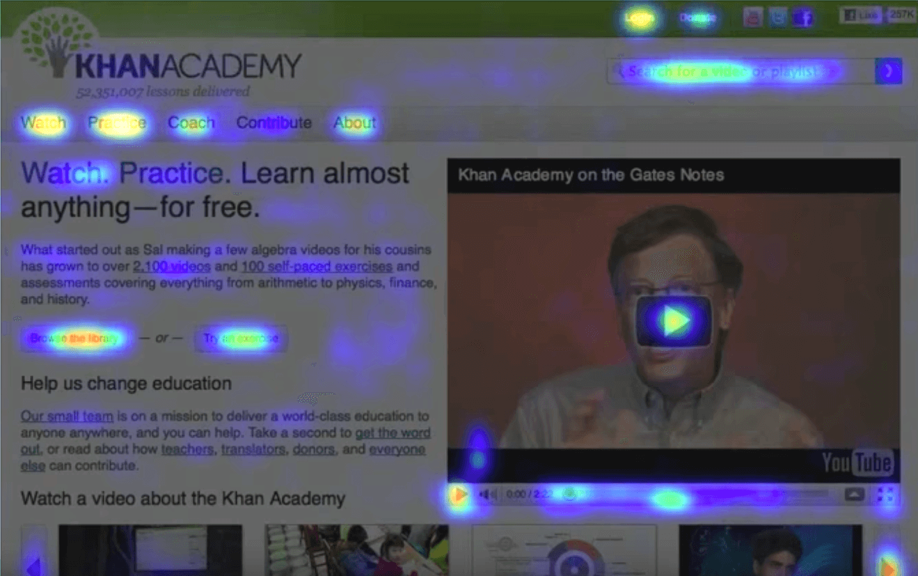
What does this show us? In the top menu, users are clicking extensively on “Watch,” “Practice,” “Coach” – but not “Contribute,” which is getting almost no attention.
“Search” gets a lot of action, the video gets played a lot, and the two CTAs under the first header are also getting plenty of attention.
We can also see that the social links in the top right-hand corner of the image aren’t getting any attention at all.
By simply seeing where on the page people click, you can determine if you need to move any of the images around, make the right course of action clearer and easier to find, and find out how confused your visitors are.
There’s more.
The same page in Scroll Map shows that the biggest concentration of attention is the middle of the screen above the fold:

That’s normal. Scroll down into Khan Academy’s large collection of links to specific pieces of content that they have on their homepage, and things start looking more like this:
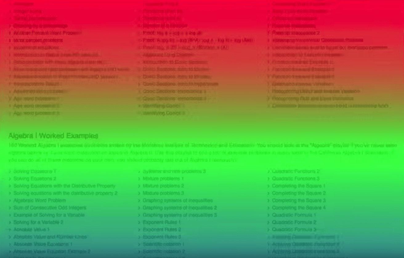
Again, that’s normal. What you can then do is compare the impression you’re getting with this Scroll Map report with the list view.
That shows you how many people clicked on each link as a table of raw numbers, not in proportion to the number of visitors.
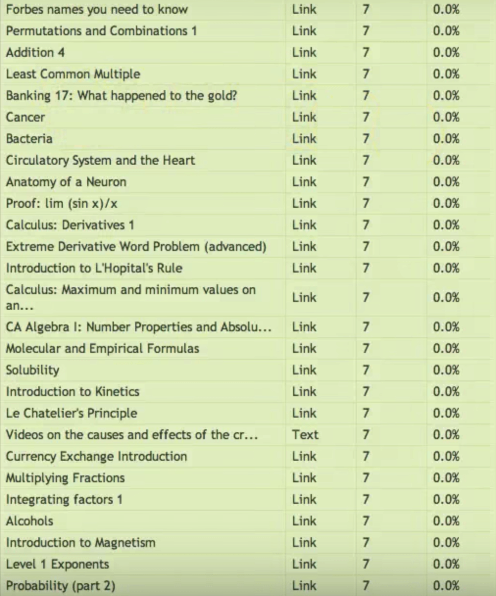
The long tail of link clicks in List View matches up pretty well with the long tail of attention that we saw in the Scroll Map report. Few scroll down this far, but of those who do, many click one of these links. That tells you that the links are probably in the right place and worth keeping.
Heat Map and Scroll Map can be used together to get a clearer view of visitor behavior.
For instance, here’s Khan Academy’s Contribute page in the Heat map report:
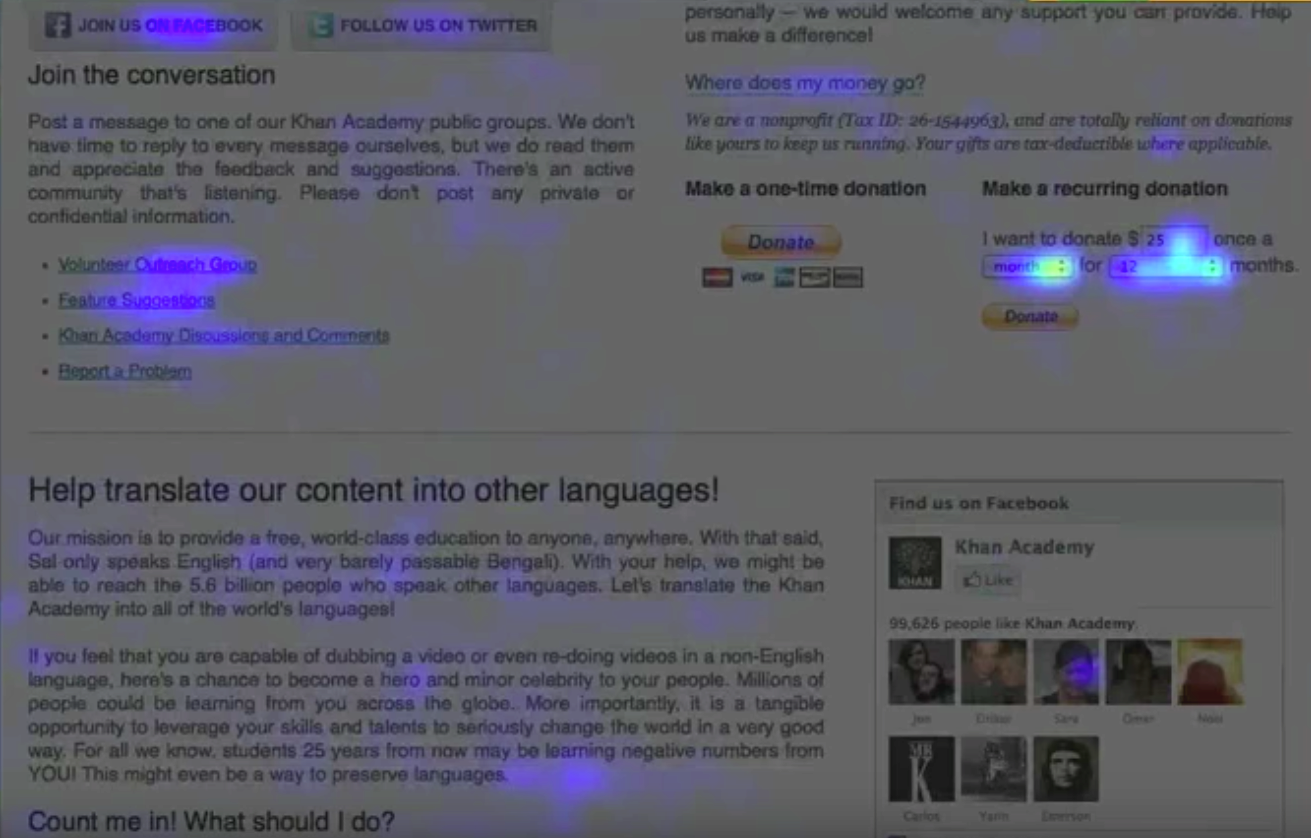
You can see the majority of attention is going where they want it: to the recurring donation CTA on the right side of the page.
But this page has two goals. The other is to get people to sign up to become translators.
And when we take the page over to the Scroll Map, we can see why not too many people are clicking on that link:
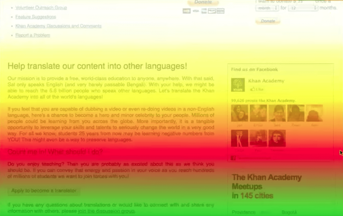
Only about half the people visiting the site even scroll down that far. Move the CTA? Give it its own page?
Or is the copy not persuasive enough to keep people reading? Check the color changes to see.
Looks like it’s “Count Me In” where people stop looking. That first paragraph, under “Help translate our content into other languages!” isn’t grabbing readers and holding them.
By using the Scroll Map to see where attention falls away and the Heat Map to see where actions change, you can not only build a picture of what people do but why they do it. That gives you the knowledge you need to make decisions that lead to conversions and growth.
You can check out a full video walkthrough of Khan Academy’s heat map strategy here:
Now, let’s get started with your heat map.
Heat maps: Getting started
Heat maps are relatively simple to set up. Setting up a Crazy Egg heat map takes literally a couple of minutes. Once it’s set up, checking back to access your reports is also super simple.
How to create a heat map step by step
Step 1: Sign up
1. Create a CrazyEgg account
Go to https://www.crazyegg.com/ and sign up for a trial. You get 30 days free so you can start running heat maps on your site, as well as user session recordings and even A/B tests.

You’ll be asked to choose a plan. That’s the sign-up process complete.
Step 2: Set Up a Snapshot
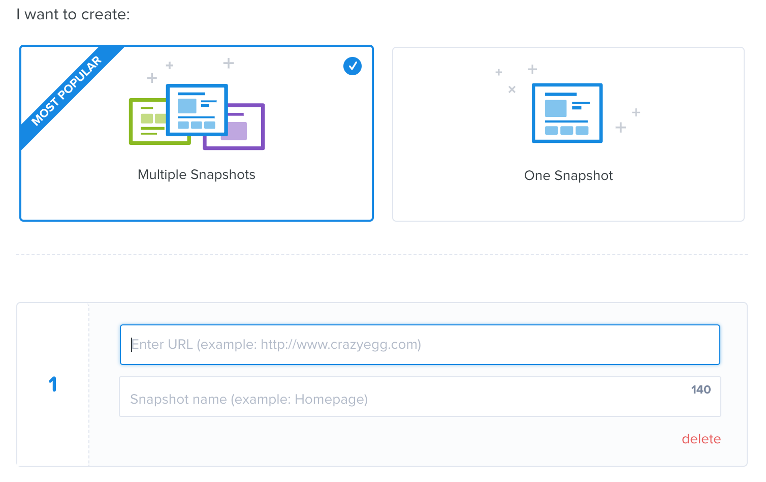
Head over to the New Snapshot page in your Dashboard and set up a new report.
Drop the URL of the page you want to test into the URL box. (Make sure the tracking code is on that page!) Name the snapshot anything you want that makes sense to you.
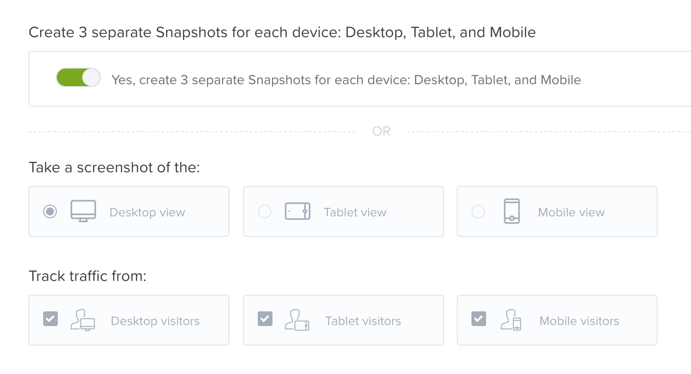
Then, pick whether you want to run a report that captures desktop visitors, tablet views, mobile visitors — or all three.
Then, figure out how long you want to run the report:

You can end after a set time or after a set amount of traffic. The default is 60 days or 25,000 visitors, but you can get in there and change it if you have low traffic or you think you can find out what you need to know with fewer visitors.
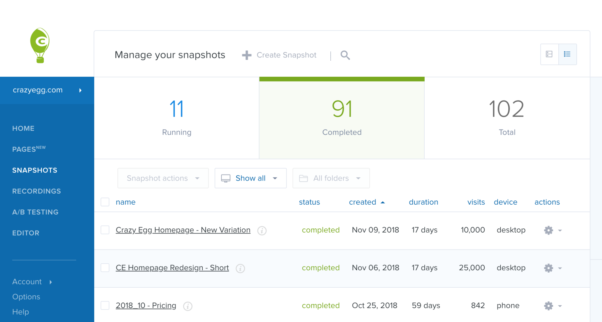
When your snapshot is up and running, you’ll be able to see it on your dashboard.
7 Heat Map Case Studies
Here are seven data visualization examples of how people have used Crazy Egg heat maps effectively:
1. Softmedia Boosts Conversions by 51 Percent
Penny auction software provider Softmedia used heat maps to identify problem areas on their website.
They successfully identified distractions that were preventing visitors from completing their desired action. After removing these, conversions increased by 51 percent.
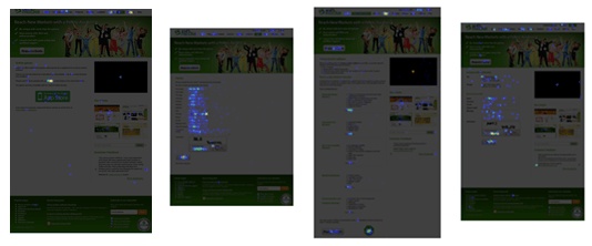
The left pair of heat map images shows that a “Do not click here” button was distracting visitors from clicking the “request a quote” button.
The right pair of images shows visitor clicks on the contact page, where a video demo distracted visitors from contacting Softmedia.
Removing both improved conversions for each page.
2. Conversion Rate Experts Improves Opt-Ins by 25.9 percent
CRO agency Conversion Rate Experts wanted to improve opt-ins on a particular page.
While it was performing adequately, the heat map data showed that some visitors were distracted by sidebar content and therefore never completed the opt-in box.
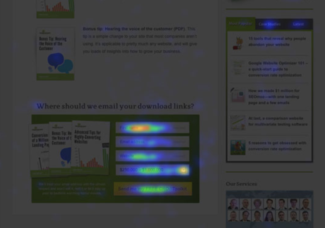
An A/B test showed that a new page without the sidebar resulted in a 25.9 percent improvement in opt-ins.
Watch how the pros use Crazy Egg!
3. WPMU Dev Troubleshoots Product Page Design
WPMU Dev used Crazy Egg’s Confetti report to see how visitors, especially new visitors, were interacting with content on their CoursePress product page.
They identified parts of the navigation menu that visitors ignored, along with some great videos that nobody ever watched. This information was fed into a planned product page redesign.
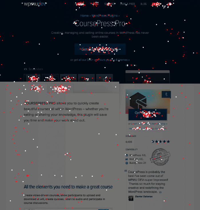
Can you guess what’s wrong with this picture? Yep! Too many calls-to-action and elements that visitors can click on. What they really found was that no one was clicking on (and viewing) the things they wanted visitors to see.
4. Local Visibility System Improves Local SEO
Small-business SEO consultant Local Visibility System (LVS) created a custom URL for Google Places (now Google My Business) and tracked visitors to that URL via Crazy Egg.
The resulting Confetti report showed where local visitors went after landing on the site, enabling them to see which pages required additional optimization.
(There’s also some useful information on using Crazy Egg with maps, directions, and reviews, which are all part of local SEO.)
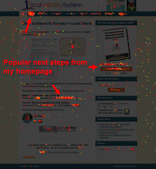
Sometimes crazy-looking heat maps can appear scary. “They’re clicking everywhere!”
But it may illustrate that people are actually reading most of the page and clicking through to more information. How can you use that to your advantage?
5. Pagely Checks for Design Flaws
WordPress hosting platform Pagely used Crazy Egg’s scroll map to identify which parts of their page people paid attention to.
The company found that fewer than 25 percent of their visitors scrolled beyond 600px, which meant that a lot of the page was wasted.
This information suggested that Pagely should rethink the layout to ensure that visitors would see the most important information above the fold.
Additionally, they found that tying clicks to specific conversions is an even more important analysis to perform:
Knowing how many pageviews turned into clicks, and how many clicks actually converted to signups is extremely valuable information. Combine this knowledge with your A/B tests and see which variation not only gets more clicks but signups too.
6. SugarRae Adjusts the Content Mix
SEO blogger SugarRae used Crazy Egg heat maps to identify which content appealed to visitors most.
She identified the three navigation labels that got the most clicks and used that information to decide which content she would create more of in the future.
She found that visitors were trying to click on non-clickable images and also figured out which ads were working best so she could optimize the mix for more clicks and revenue.
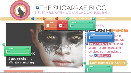
The overlay view allowed her to segment visitor clicks by properties like referral source.
7. Harry Fay Jewellery Boutique Plugs a Profit Leak
Harry Fay Jewellery Boutique identified several areas that were driving visitors away and affecting profits, including
- failing cookies notifications
- Losing visitors to social pages
- unanswered customer questions in the ordering process
After identifying these issues, the online retailer made some design changes and found that the recovered profits more than paid for the investment in the software.
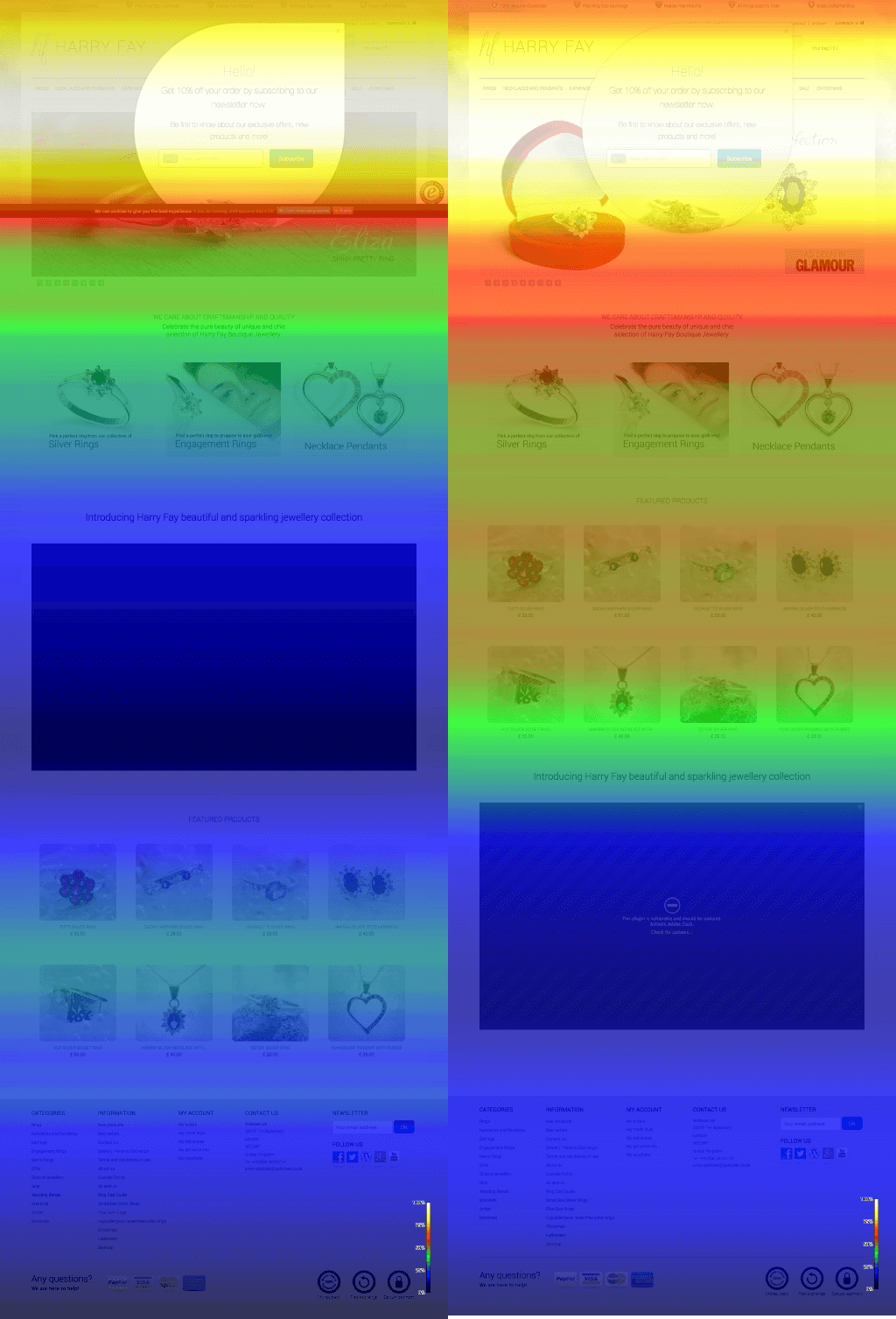
Scroll Maps quickly let you see if people are even looking at the content you’re most proud of. In this example, comparing the Scroll Maps before (left) and after (right), the images show that a much higher percentage of people are now watching the promoted content.
How to use Crazy Egg Heat Map Tool: Example
Here’s an example of someone — Crazy Egg, in fact — using the tool to address issues on their client’s homepage. Working on Neil Patel’s own website, the goal was to increase conversions by 100 percent.
In the end, the team managed to increase conversions by over 400 percent, based on findings from the Crazy Egg tool.
Work began on Neil’s homepage:

Take a look at the source, and you’ll see it’s a long page. Nothing wrong with that, but this page wasn’t converting. Initial Scroll Maps showed that only about 50% of the audience was reading much past halfway down the page, and relatively few visitors saw the bottom at all.
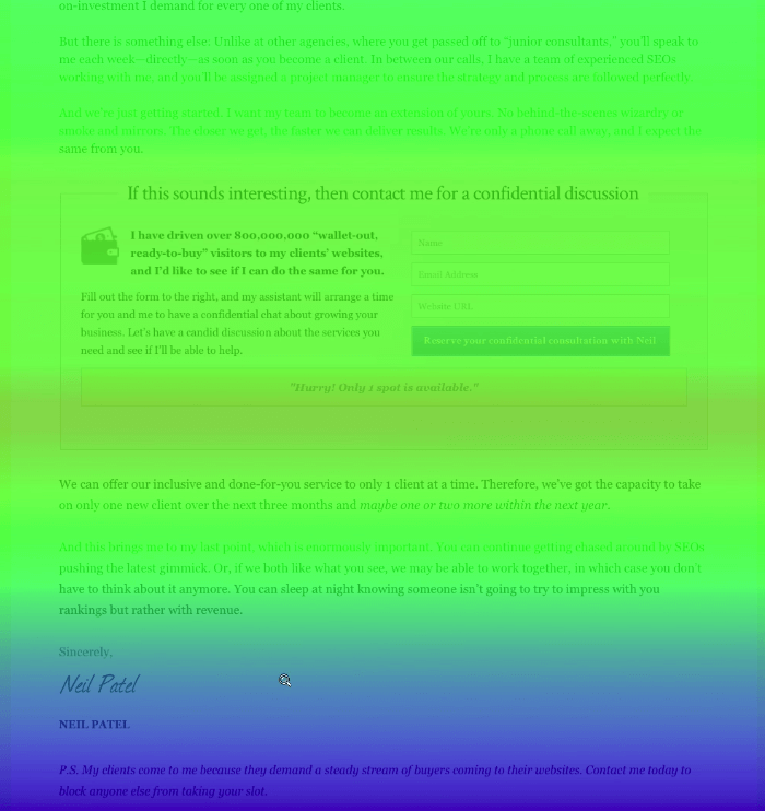
Meanwhile, the Heat Map showed that a lot of visitors were actually clicking on Neil’s name at the top of the page or on the logos of clients, while relatively few clicked on the CTA.

A lot of people were clicking on places that weren’t actually clickable – a familiar story.
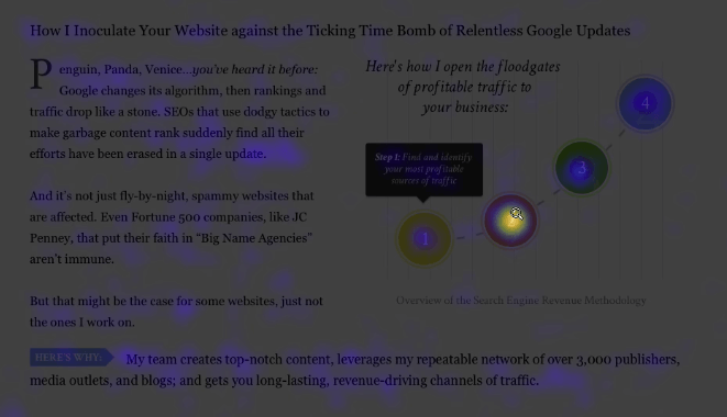
Furthermore, the option to click away to case studies was creating drop-offs: more people were looking at the case studies than were signing up!

Looking at the Confetti report, it was easy to see that 49% of the traffic coming to the page was coming from QuickSprout, Neil Patel’s personal blog, meaning visitors likely already knew who he was.
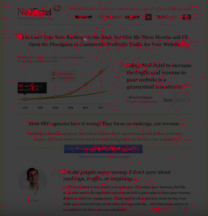
“That’s why,” says Mike Kamo, who ran the heat map reports, “we realized that we don’t need to sell these people so hard.” Too much of the page was telling visitors things they already knew.
Maybe they could go more minimal?
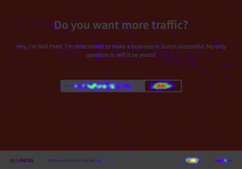
The new page was as simple as it gets: A header, two lines of copy, and a single-field form.
Rather than have people fill out a form right away, visitors now put their website URL in and have it analyzed, then add their details later.
(Does that sound familiar? It should ― it’s what Crazy Egg’s homepage offers, and a bunch of others besides.)
“When people discover that there are errors on their site, it makes them more likely to want to sign up with us,” says Mike.
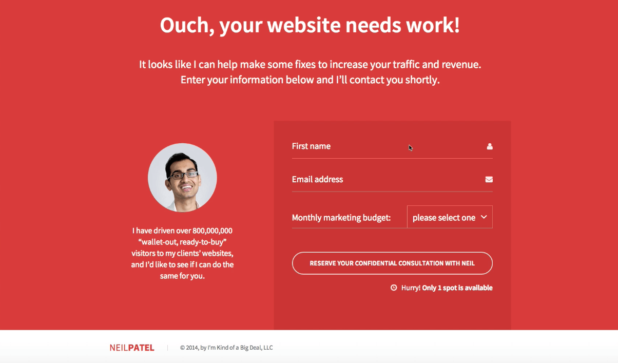
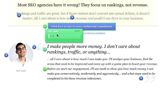
At the bottom of the new homepage, you can see two options: Consulting and Testimonials. The consulting page now looks similar to the original homepage and contains a lot of the same copy:
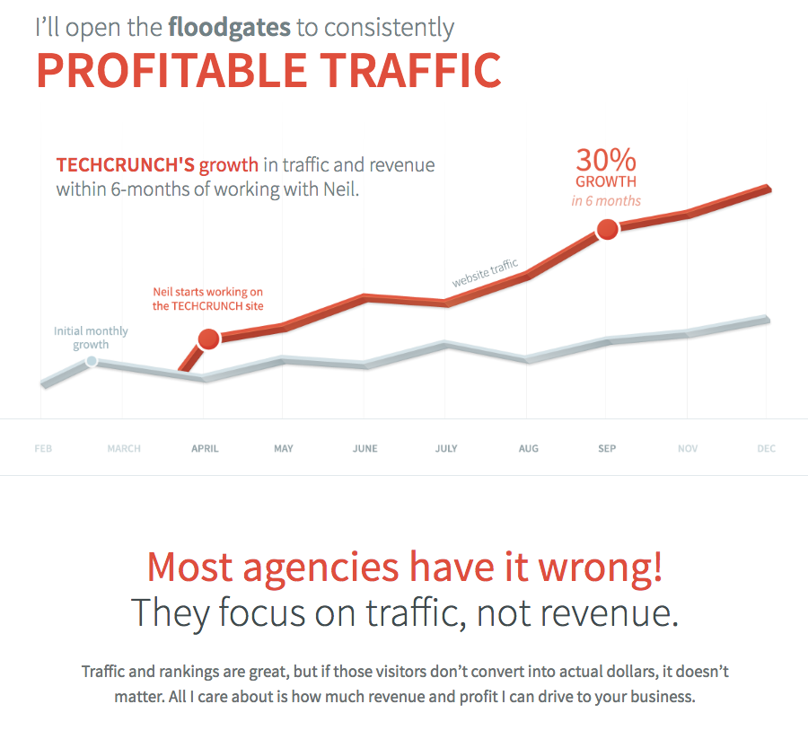
But it’s only for people who go looking for it because they feel they need to know more. Most visitors just use the main form on the homepage.
The difference in performance between the two pages is massive. The first page saw just 2.1% conversions.
On the new page, 26% of visitors filled in the first form.

The new page is a two-step process, and not everyone who filled in the first form became a lead. Check up on the second page and the actual conversion rate is 9.1% – a 433% increase in conversions.
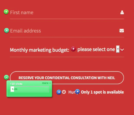
By using the different types of heat map together, Crazy Egg was able to generate massive increases in conversions.
Obviously, no heat map tool or any other tool comes with creativity built in or gets rid of the need for great design, copy, and SEO.
But it does let you see what’s really going on and change the way your site is built to reflect that.
Conclusion
A heat map is the backbone of any CRO (conversion rate optimization) strategy. It’s also a highly underrated tool for how powerful it is.
Heat maps give you a clear indication of what visitors really do on your site. You can quickly and easily find out if anyone even sees your copy and whether people are clicking on your CTA or on images and words instead.
You can also see where your visitors are coming from, keep an eye on your pageview-to-click conversion rates, and much more.
Instead of having to deduce what’s going on from numbers like bounce rate and time spent on page, or tracking goal conversions in GA, heat maps help you build up a more sophisticated picture from knowing which elements are clicked or ignored.
We’ve seen how heat maps can be used to understand conversion behavior and optimize your sales funnel.
Using a simple heat map lets you see if visitors are clicking on your conversion elements, and if not, what they’re clicking on instead.
It’s almost always something unexpected.
And it lets you answer a question no amount of bounce stats can: why are people leaving your site?
Based on that understanding of real, rather than imagined, user behavior, it’s possible to come up with better design and copy and generate much higher conversions.
Data from Confetti and Scroll Maps lets you identify user behavior in a more sophisticated way while keeping heat map analysis as intuitive as looking at the screen.
Cross-referencing Overlay, List reports and User Session Recordings lets you see where attention is going and exactly who is clicking where.
Segmenting traffic by activity and source, and understanding it in terms of the number of visitors who actually viewed that part of the page, can save you from “mis-optimizing” the wrong parts of the page. It can also keep your content game strong!
It’s tough to beat this simple, versatile tool for optimizing pages or whole websites.

